Brand Refresh
Working with the original logo and main brand colour, we designed a whole new look that includes well thought out colours, new branding elements and new font pairing.
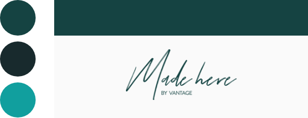
Made Here’s original colour palette included green, dark green and teal. Since there was no brand style guide to follow, designs in the past lacked consistency.
Refined colour palette picked out with purpose.
New Tool Kit including updated font and brand elements.
Detailed Brand Style Guide that includes rules for all branding basics and social media templates.

The new colour palette gives the shop a more elevated + grounded look. The primary green was updated to a more versatile, mellow hue. New colours were added, including a “Dream Factory” blue, and a range of soft blush tones to warm up the palette. The dark green was replaced with a dark navy to help blend the colours together and add more depth.

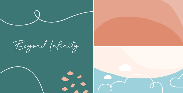
Typography: Keeping the original primary font Avenir, a new secondary font was added for call outs and headlines. The sleek cursive font Beyond Infinity, mirrors the logo and pairs well with the new brand elements.
Brand Elements: Three vector based brand elements were added to the tool kit including; a shape, line and dot texture. Together they create an organic, handmade feel that reflects the nature of their products.

Social Media Templates
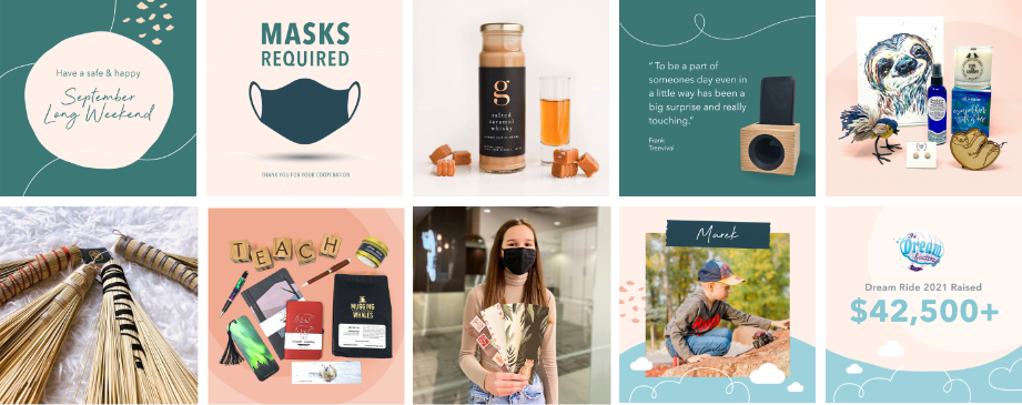
In order to maintain a high quality social media presence, a series of strategically designed templates were created. Looking back over Made Here’s post history, we collected and critiqued the best and worst posts and graphics. Next we benchmarked ideal content, graphics and imagery. Knowing what type of posts work, we organized the information into content categories, and designed the graphics accordingly.
Made Here did not have a solid Brand Style Guide to follow in the past, therefore designs were left to interpretation and post graphics lacked focus. This created an instagram grid with multiple styles that appeared to change regularly.
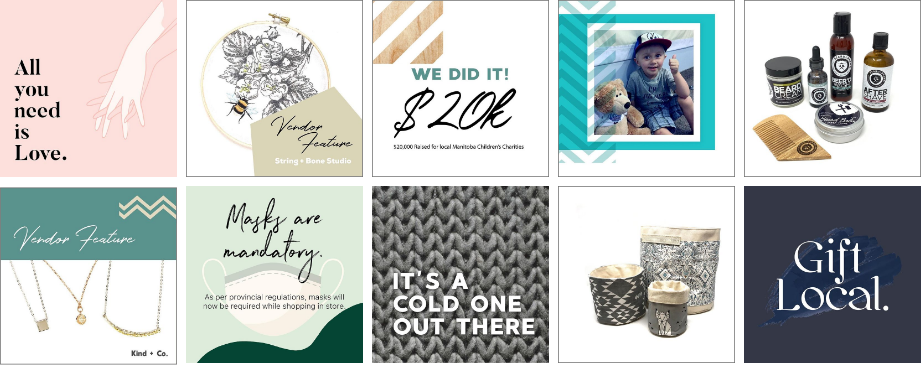
With the new Brand Style Guide in place highlighting five new social templates, Made Here’s instagram page began showcasing their new look. Rules for imagery, colour and graphics were explained for each template in order to maintain a high post quality.


Instagram Highlight Icons
Highlight icons were created with the new look to help organize and showcase the store features.

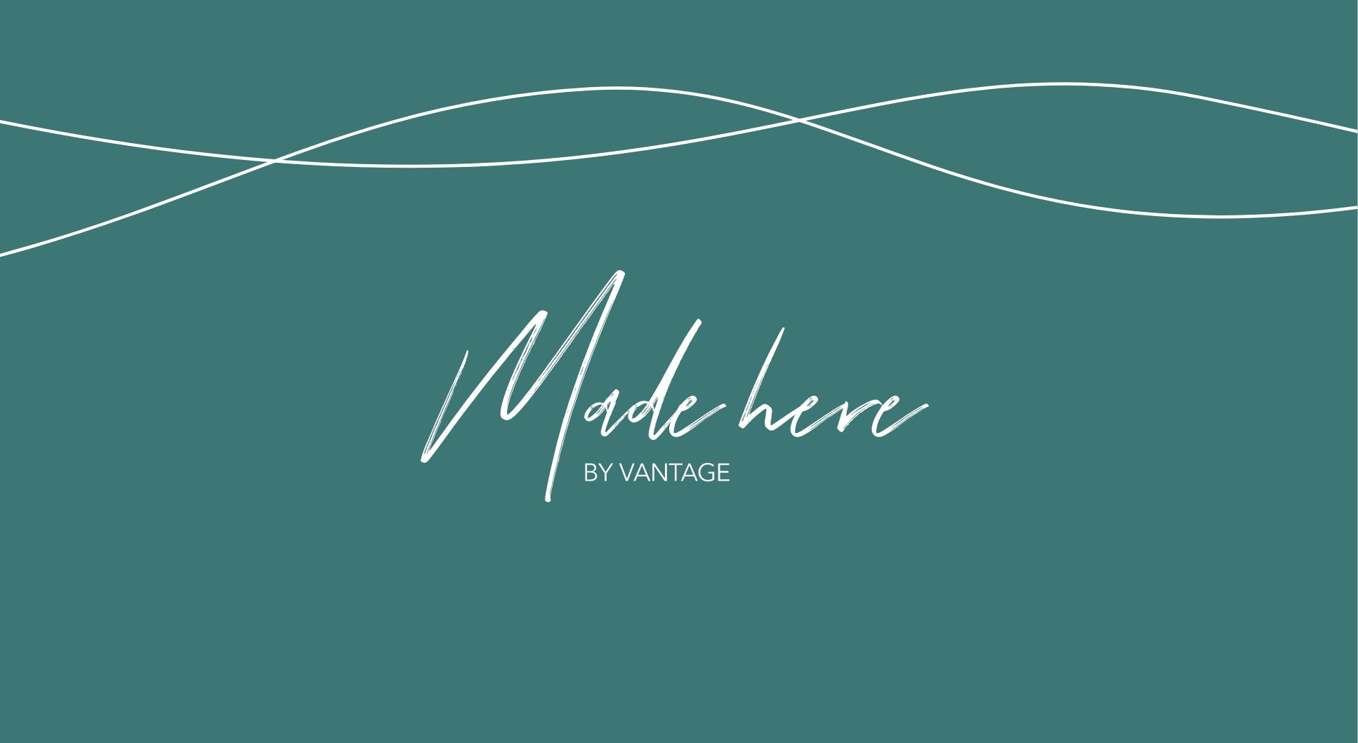
Made Here
003
Branding
Featuring products from local makers and artisans Made Here, is a Winnipeg based shop that gives back to local children’s charities. Partnering with The Dream Factory, an organization whose mission is to make dreams come true for kids in Manitoba battling life-threatening illnesses. Working with Vantage Studios, Made Here got a brand refresh. Keeping the logo, we modified the look with a refreshed colour palette, and modern branding elements.
Made Here sells products in-store as well as online, with a focus on their social media presence. The brand update included a social media guide with a collection of custom templates. The completed look has a charming, earthy quality that nods to the handcrafted style of the makers.
CREDIT: Vantage Studios